Arden, Brand Design for Tile Giant
2025
Arden, flooring range
for Tile Giant
Introduction
Tile Giant launched Arden, a wood-effect flooring range inspired by the meaning of "great forest." This theme of nature, warmth, and luxury shaped the visual identity I crafted, designed to translate seamlessly across Tile Giant’s website and print for their 50+ stores.
The Brief
The goal was to create a refined yet inviting brand identity, balancing natural textures with modern luxury. This extended across:
Header boards for in-store product displays.
Web banners for a cohesive online presence.
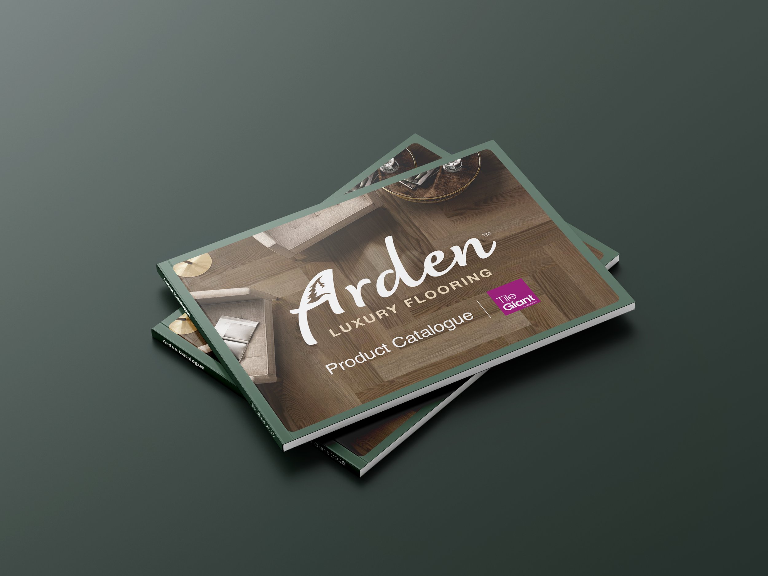
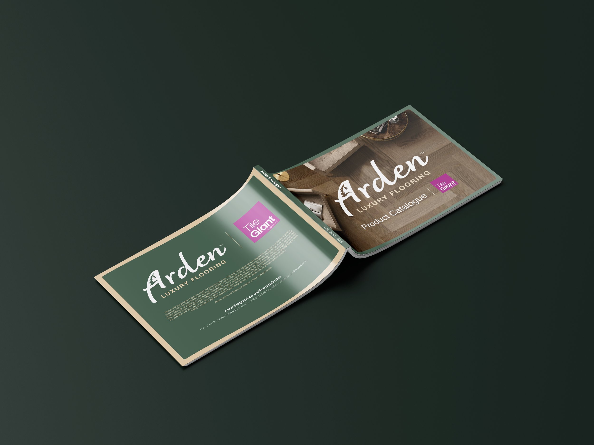
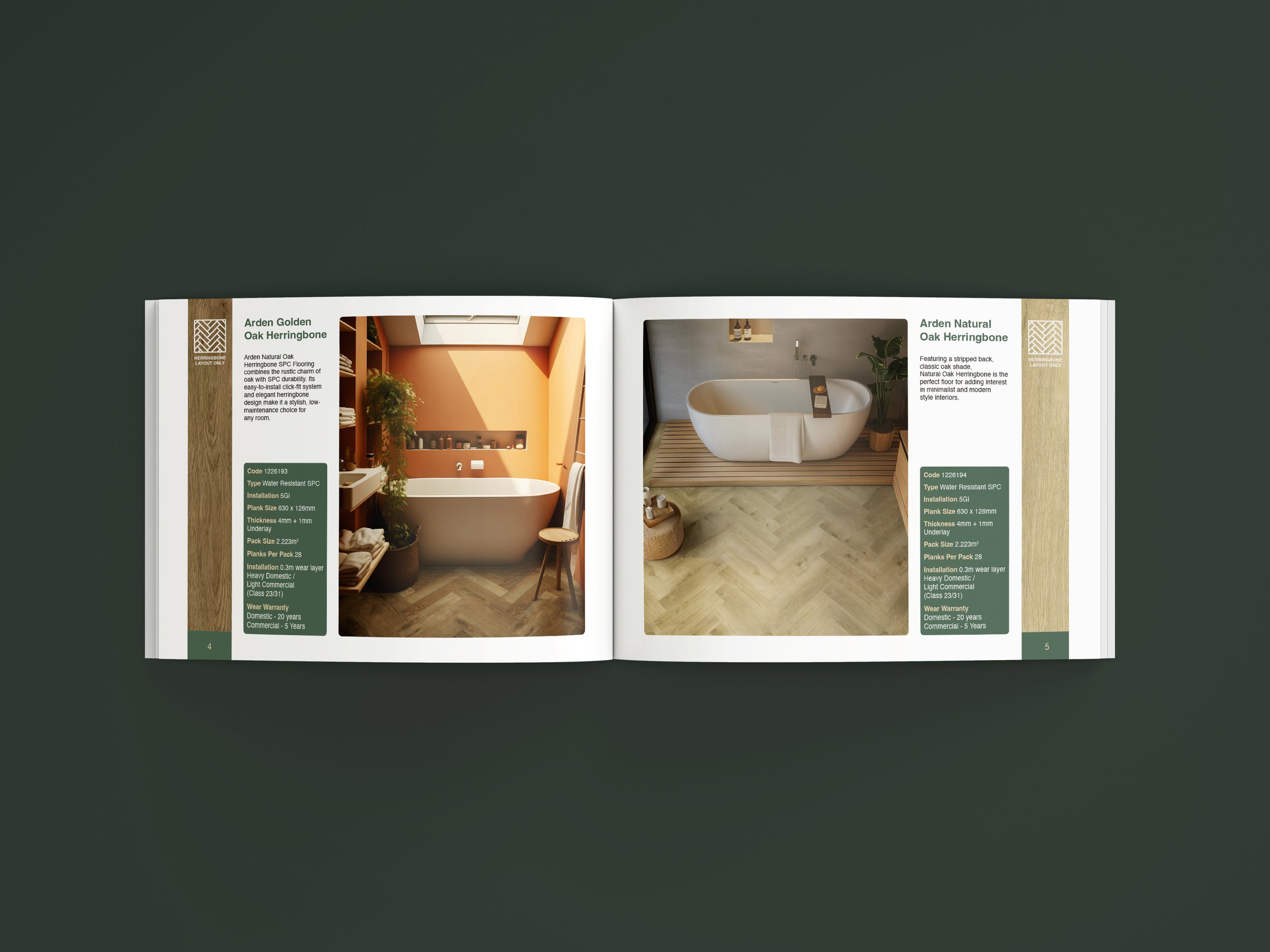
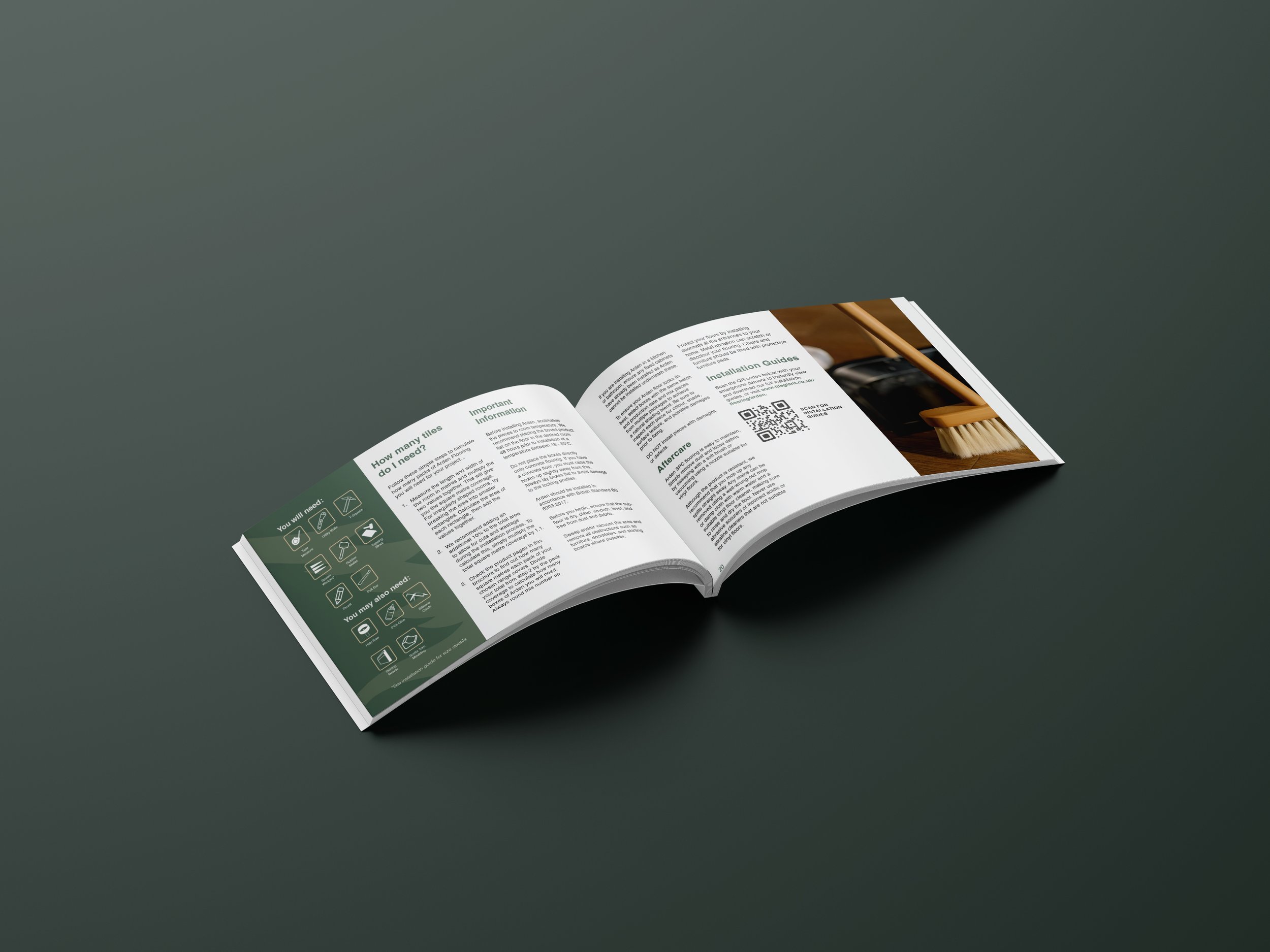
An Arden-branded catalogue showcasing the range.
The final identity captured Arden’s forest-inspired essence, blending organic warmth with contemporary design.
Employer
Tile Giant
Year
2025
The Logo
The Arden logo blends elegance with nature, reflecting the range’s forest-inspired theme. The counter of the "A" features a pine tree silhouette, reinforcing its connection to wood and the outdoors.
Custom Lettering – A refined script conveys warmth and luxury.
Natural Symbolism – The pine tree in the counter subtly ties into the brand’s theme.
Earthy Colour Palette – Muted green and soft beige enhance the organic, premium feel.
Framing with Foliage – Abstract tree shapes in the background create a cohesive look.
A minimal yet expressive identity, designed for luxury wood-effect flooring.
The Catalogue
